When I started making logos, my plan was to create a bunch of different ones so I could ask people which one they liked best, and from there, choose my final logo. But before I could even do that, I had to come up with a bunch of different designs first. After making like 5-6 logos, I went to the teachers for some feedback because I was kind of stuck and wanted ideas on how to make more. One of the teachers suggested I choose one logo that I personally liked, and then create a few variations of that same logo.
So basically, the new ones would still look kind of similar to the original, but just different enough to feel like separate logos.
Before:
After:
I ended up doing this with a lot of logos, and because of that, I had way more options that still tied together nicely. That piece of feedback was actually really helpful—it gave me a method to expand on my ideas without starting from scratch every time. It also meant I had more logos to show classmates, which made it easier to decide on a final one. There was one logo that stood out more than the others based on what classmates and teachers said, but I didn’t end up picking it. It just didn’t fit well on my website, so I went with the one that had the second-most votes. I think it was the better fit in the end.
https://www.figma.com/design/HCQKkvDwA22GNB7ioTTPn5/Logo-portfolio?node-id=0-1&t=GV0qge8O23IVaCMz-1
When I started designing my portfolio website, I added a lot of animations because one of my goals this semester was to learn JavaScript animations. I made sure that every page had at least two or more animations since that felt like the best way to really get the hang of it. Once I had my first design ready, I went to my teachers to ask for feedback—mainly on the animations and the colors.
Before feedback:
After feedback:
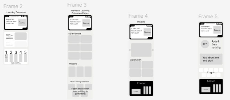
The main feedback I got was that I should avoid using too many animations because it could get confusing, too complicated, or just straight-up messy. So I ended up removing some of the more subtle animations that didn’t really change the look or feel of the site too much. That honestly helped a lot, because once I actually got into coding everything, it was already a lot of work. If I had kept all the extra animations in, it would’ve taken way longer and probably would’ve been super overwhelming. I’m really glad I was told to be careful with how many animations I use, because now the website feels a lot cleaner and more focused (if I do say so myself).
https://www.figma.com/design/b3v4bYncGiREYJtuCNlcrr/SEM-3-portfolio?node-id=0-1&t=tDD5OwAExzMoXQ08-1
I did a user test to check if the navigation on my website was clear. I asked a classmate to try going to different pages. Most of them were easy to access, but I noticed that the way to get to the separate Learning Outcome pages wasn’t very obvious. The boxes under the numbers that count up are actually clickable, but it’s not clear to the user. After noticing this, I quickly added a bit of text to let users know the boxes can be clicked. I might still need to add another way to access Learning Outcome 1 just to be safe.
The user test was really useful and gave me a better idea of what still needs improvement. I’m planning to do a few more tests after I’ve added more content to the site, maybe with a different classmate or even a teacher. I’m doing this because during last semester’s final assessment, I got feedback that my navigation was confusing, and I want to make sure that doesn’t happen again.
Doing this user test really helped me spot issues I didn’t notice before. Even though most of the site is easy to navigate, I realised that some parts—like the Learning Outcome links—need to be made clearer. Just adding a bit of text made a big difference. I’m glad I tested this early on, because now I have the chance to fix it before it becomes a bigger problem. I’ll definitely keep testing as I go, just to make sure everything stays easy to use.
While making the website in React, I initially used the Google Translate API because it’s known for accuracy. However, I quickly discovered that Google’s API is paid, and since I wanted a free solution during development, I had to switch. That led me to MyMemory Translation, which offers a free tier and seemed like a good fit.
At first, everything worked fine. But I later found out the free version only allowed 5,000 words per day, which is barely usable once I started testing multiple pages with lots of translated content. This limitation forced me to dig deeper into the service, and I found that by adding a registered email (mine) into the request, the daily limit increased to 50,000 words. This small change made a big difference, and I was able to keep using the API without paying or getting blocked.
But I still wasn’t happy with relying completely on external APIs. I noticed that the translations were sometimes off, and the user experience suffered when the API was slow or returned errors. So I added a layer of manual translations for supported languages like Dutch and German using a local object in the code. This way, key UI phrases could be manually defined and wouldn’t even need to call the API.
I also built a TranslateWidget dropdown button that stays fixed on the screen and lets users switch languages anytime. It updates the language context, which the rest of the app reacts to instantly.
This was a turning point in my development process. Originally, I thought translation would just be a plug-and-play feature using Google’s API. But after facing pricing issues, usage limits, and reliability problems, I realized I needed more control and fallback options. Switching APIs, discovering the word limit trick, and then building in manual override support helped me turn a fragile feature into a dependable one.
It also helped me practice real-world problem solving—balancing cost, usability, performance, and user experience. In the end, I was proud not only of the widget's functionality but also of the fact that I learned how to adapt quickly when my first solution didn’t work out.
https://refuture-peach.vercel.app/