Projects
This is the projects page.

As part of our ICT & Media study, we were tasked with creating a full branding and product concept for a fake company — and honestly, it turned out to be one of the most creative and rewarding projects we’ve done so far.
The project kicked off with a brainstorming session where we had to come up with a name and branding for our fictional company. We were given a lot of freedom, so we wanted to make it fun and memorable.
We started with a pretty funny idea: basing our branding around the iconic Belgian pop group K3. Our teachers actually loved it and found it hilarious. But after a bit of thought, we realized it might not be taken seriously enough in the long run. So, we went back to brainstorming and eventually landed on The Frontyard Boys — a play on Backstreet Boys, and luckily, our teachers liked this idea even more.
For our branding, we wanted to keep a balance between fun and professionalism. We kept the pink as a subtle nod to K3’s influence, and added blue to give it a more serious, trustworthy feel. From there, we developed a full visual identity — logos, colors, layouts — the whole package. It was fun seeing our made-up company come to life visually.
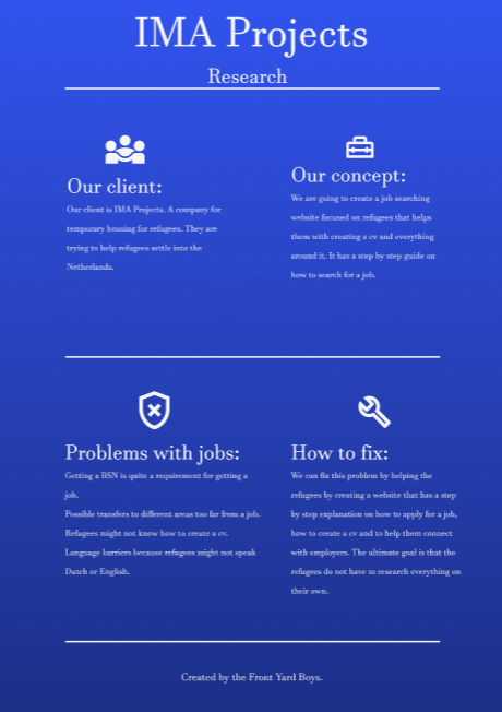
After creating our brand, we had to pitch it to a real client. The client’s project focused on helping refugees integrate into Dutch society, and we had to convince them that our team could take on the challenge. They loved our branding and chose us to develop their project.
Our next step was to define what we would actually make. There was one other group working for the same client, so we sat down with them and decided to split responsibilities: they would focus on language, and we would take on employment. That’s when we started shaping the concept for our platform.
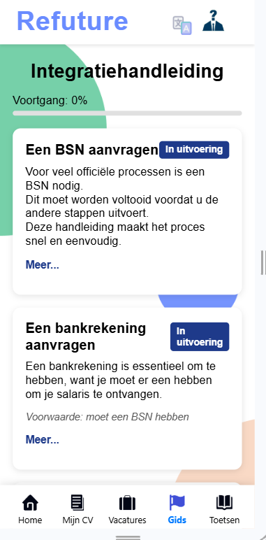
We decided to build a web app using React, aiming to support refugees in the Netherlands with employment and integration. Our idea was to create a platform that was more than just a job board — we wanted it to feel like a community. We called the project Refuture, combining "refugee" and "future", to reflect the goal of building new opportunities.
Refuture would bring together several key features in one place. It would include a social feed where users could share their stories, tips, and experiences with others going through the same journey. It would also offer a CV-maker tailored to Dutch job applications, along with a job board specifically focused on refugee-friendly opportunities. To help with the more practical side of integration, we added a guide page explaining essential Dutch documents like the BSN and how to set up a bank account. Finally, we included a language test tool so users could get an idea of their Dutch and English levels.
We created several design mockups, gathered feedback from our client, and adjusted the concept and visuals accordingly. We also had the chance to visit the refugee camp where our client worked, which gave us a much better understanding of who we were designing for and why it mattered.
Even though I didn’t have much React experience going in, we divided the tasks and collaborated through GitHub, and development went pretty smoothly. We had several feedback sessions with our client throughout, which helped us stay on track and improve along the way.
At the end of the project, we showcased Refuture during an open market-style presentation, with both a mobile and desktop version on display. Our client was really happy with the final result and said she appreciated how much effort we put into the project — which was a great way to wrap it all up.
All in all, this project taught me a lot — from branding and client communication to teamwork, coding in React, and building something with real-world value.